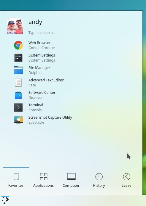
Launchers in an OS have become the central point of access and interaction with system content. It is the main way that most people will interact with applications and files. In recent years, other OSs have become increasingly interested in beefing up their application menus. Plasma currently has 3 launchers integrated. Users are asked to select one or the other by right-clicking in the “start” menu button and switch a different launcher. The interaction is somewhat quirky but it is effective.
I wanted to contrast our iteration with something that might be more interactive, more straightforward and help users find the desired content faster. Here is an idea about that.
Please note that these mockups are just images. The layout, color and interaction is what I am trying to discuss. Is there merit to this convergence idea? Does it solve any issues?
Launchers
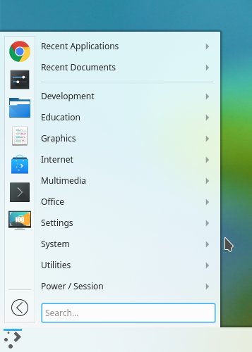
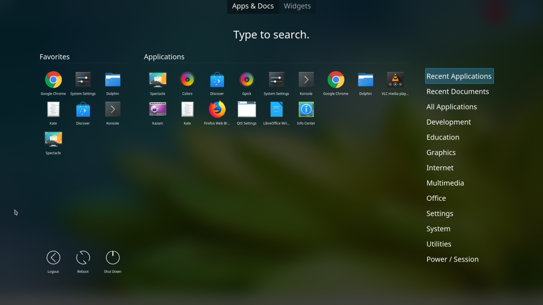
Plasma currently has 3 launcher styles added. I believe all of them can be converged or made to look similar. However, given user requests, we have to keep 3 of them and they currently don’t seem to correlate visually. We have the dashboard launcher (WIP), Kickoff and Kicker. Each of them brings different kinds of interactivity and space savings for the users.
I would like to propose a visual merge of these three applications so that they look more cohesive, tight and closer to a Plasma style.
Things to note:
- Icons are not meant to be final. They are just a representation
- Spacing is relative
- Current elements on the screen are meant to be there
Introductions
Fullscreen button: Will resize from kicker to dashboard launcher, from kickoff to fullscreen launcher. Removed the idea of right-clicking the menu and offered visual controls.
Kickoff Menu: To provide consistency, I preserved the kickoff bottom menu bar throughout the different iterations. This will take care of the category clutter menu that is present in the dashboard launcher.
Things to Consider
- I don’t know the possibility of creating this code-wise. I welcome feedback.


We can make the dashboard the secondary default
it will launch when the user make some action like double click for example
I think this behavior will be more usable
And by this way u will have all the goodies
sound reasonable to me, but I would really like to have the dashboard the way it is presented in the last mockup/picure of this blog post https://anditosan.files.wordpress.com/2018/06/fullscreen.png?w=1000
IMO a favourites section is not needed in a dashboard view.
didn’t see the fullscreen launcher setup has a favourites section.
I thought it has all applications alphabetically sorted in a dashboard overview.
But of cause, that would only make sense if there is another option (or perhaps this could be configured) with which you can have favourites, leave options (like shut-down. reboot) and categories.
I think the spread out is a total mistake.
Mostly one cannot simply foresee what the application is for by its icon and name.
Where freedesktop spec. stands in, the launcher is capable of sorting things in categories by the function, and that is absolutely what a newcomer needs at first attempt (to KDE or Linux world).
My thinking here is that users are in control of what they install. So there is less of a chance that they won’t know what an application is for. Don’t you think? Also, being that applications are popular, who wouldn’t know, for example, that Firefox is a web browser?
Something worth considering – What happens if someone else who uses my computer does not know what things are?
In my case it would be my wife or kids with wildly varying understanding of whats going on. They don’t need know that Kate or kwrite are the “notepad” of the KDE world.
Making it more descriptive by default is not a bad thing.
Not all the people using computers had installed the software they use themselves (could be system administrators, other family members, preinstalled).
Not everyone knows what Firefox is. Imagine that these are their first steps on Linux where Firefox is usually preinstalled as a browser. They could be using Chromium based browsers and not know about Firefox which has a small market share nowadays.
In short, app descriptions are here to stay, at least as an option…
And by default systems should come with bare minimum. Only as much as can be fit into a single screen. Linux distributions ship way too much bloatware. Even KDE Kontact pulls a lot of apps that a user may or may not want.
I like the convergence look, though I really think that the application titles and descriptions have got to stay. I wonder how it would be if, as you scrolled down the list, one line of icons at a time was magnified and labeled with the app description….? Would it be intuitive? I’m not really sure, myself.
O like the deepin menu approach. There you have the option to categorize the fullscren dashboard If you want.
I like the idea of having a button to go to full screen mode.
But what should be the benefit of going to a full screen launcher? (the reason for being – other than I just like it that way)
* More description?
* More apps displayed?
* More powerful search of apps and documents?
* More ability to configure things?
The main idea is to show more applications at once for faster launching.
The flip side to that is if given too many options – a user will simply not see the one they want. it could be too crowded. (example – menus with more than about 5 items (7 at most), it becomes hard to see what you want)
Why don’t they have Breeze icons? And Breeze colors?
They are breeze icons. They just have a squared background container. Not attached to that idea. Just built for speed.
What theme are you using for the color of the menus?
Hi Enoop,
This is not a real theme. It is mockup.
Even though I’ll stick to Application menu (second picture) on my keyboard-and-mouse only laptop, this could be quite nice on touchscreen/2in1/mobile devices. For example the menu showing as fullscreen dashboard in tablet mode and switching to one of the compact layouts when docked.
Have you considered using this in Plasma Mobile?
How is the menu going to scroll when all the icons won’t fit?
As for sorting the icons in function categories… personally I don’t see why that would be necessary. Often I have to wonder in which category the program I’m looking for might be instead of seeing all the icons on one page. And app descriptions? More unnecessary clutter. If you want to make UI accessible to everyone, look at Android. They know what they are doing.
Note: could you add captions to the pictures?
There are some nice ideas in your concept 🙂
But there are also arguable changes.
Could you start a Phabricator mockup for the discussion? Also, could you use Breeze icons and theme to make your changes easier to compare with what Plasma has already?
I have to say, I really like these mockups. The idea of a continuous menu, that just changes layouts, is really good in my opinion. In addition the semi-transparent background fits the job quite well, I think. I think it is especially good for the fullscreen launcher, as it removes the side panels with categories etc., thus giving the user more space to use and a far more intuitive layout. It kind of reminds me of the GNOME launcher and I really like it on touch devices. I don’t really like the the colorful boxes under the icons, but that is a matter of personal taste, I suppose. Maybe this could be an option or set via the icon pack? Anyway, great work and I would love to see it in a future KDE release
There shoud be convergence also between the lancher and krunner imho, since search feature is overlapping.
Maybe integrating the new krunner async backend could be a wise choice for the future.
That’s an interesting idea.
I prefer the original second launcher (I don’t know if the name is kicker or kickoff). That is faster and simpler to locate an item. Having said that, I think all of them could be really improved by using tags. it could be a TAG based menu, where each additional tag could further reduce available items. It would be better to locate something that is, for instance, both a network-related, systems-related and utility-related.
Mockups look nice, but I would not want to see them replace the current default selection. I would be nice if they could be written as plasmoids, then anyone who wants them could easily download them. I *would* use them though…
P.S. What wallpapers are you using?
Also, did you make those icons? If not, is there a link to download them. They are nice as well, go along quite nice with the blur effect, and blurry themes.
The icons are all Breeze icons. However, I made the square on the background. I used the color that was most prominent in the icon to be the square background. I only did this for good organization. Our breeze icons don’t look this way currently.
I got the wallpaper from unsplash.com (It is a stock photography site, not necessarily a wallpaper website)
It looks really nice, much like the Deepin menu styles, I like it.
Oh crap. This looks fantastic!
I’m fine with classic, personally.
Hi, I would also ask those designing the start menu to have a look at this wish report: https://bugs.kde.org/show_bug.cgi?id=369405